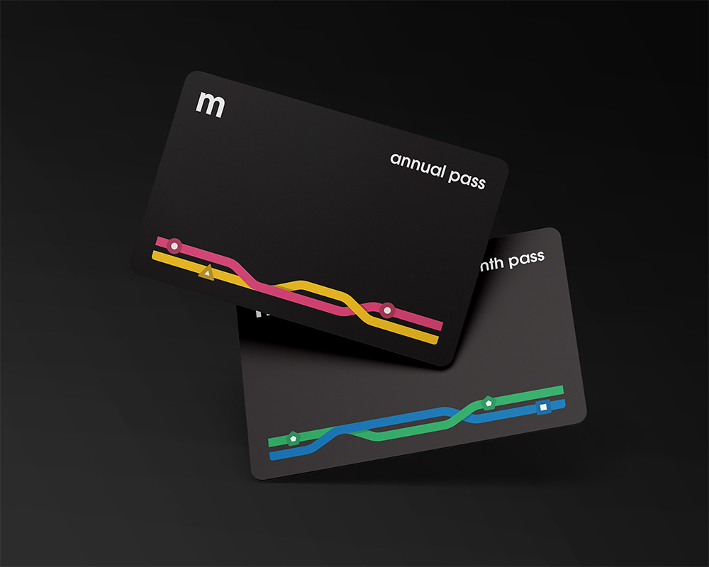
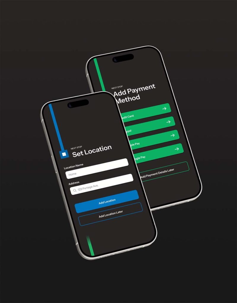
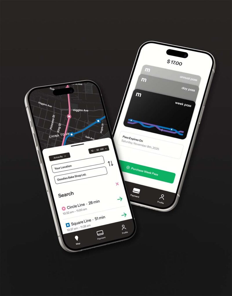
Winnipeg Metro


Landline Mono


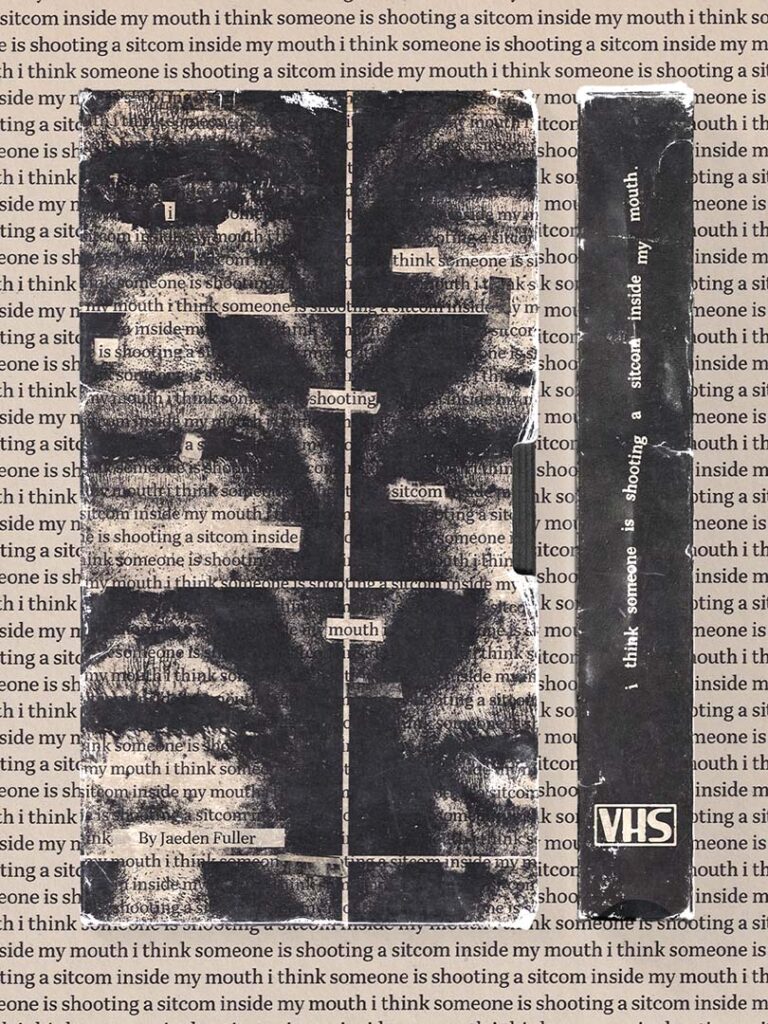
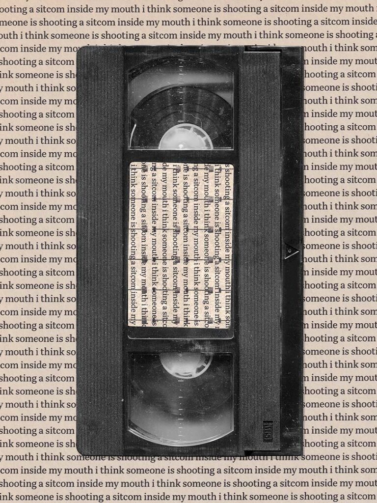
I Think Someone Is Shooting a Sitcom Inside My Mouth
Punchcard


Anilogue Collection

Motion Graphics Demo Reel
About Me
